Using Highlighter Styles
The term Grid Highlighter has been deprecated because it does not adequately describe newly added functions.
•About Default Highlighter Styles
•Viewing Highlighter Style Usage Statistics
•Example: Using the SelectorFormat Property to Change a Style on Hover
About Highlighter Styles
You can create custom styles for lists, forms, and controls. You can use these styles to highlight changes to individual records as they are listed in the list when certain conditions apply, or to emphasize certain fields within a form. For example, you can have all unlicensed products appear in a list in a bold font with a red background. After creating a style, you apply it to a control on a form or list.
Styles include text font, size, style, alignment, and color, as well as backgrounds and borders. These styles can be applied to the lists, controls, fields, and labels used on forms. See Creating a Form. See the styles under Creating a Highlighter Style.
The styles created in the Highlighter Styles workspace follow standard CSS guidelines. See http://www.w3schools.com/css/ and http://www.tizag.com/cssT/index.php for more information on CSS syntax.
About Default Highlighter Styles
Certain styles are included with Neurons for ITSM by default. In older versions (before Release 2014.3), you could not modify these styles. These older styles will be deprecated in a future release. Going forward, you can create your own styles as needed.
Creating a Highlighter Style
1.From the Configuration Console, click Build > User Interface Styles > Highlighter Styles to open the Highlighter Styles workspace. The application displays a list of highlighter styles.
2.Click Add new .... The application displays the New Style page.
3.Under the Dynamic Style Definition pane, the following default fields appear:
| Field | Description |
|---|---|
| Name |
A unique name that only contains alphanumeric characters. Spaces and special characters are not permitted. |
|
Description |
The purpose of the highlighter style. |
4.Drag and drop items from the Style properties pane onto the Dynamic Style Definition pane, then enter standard CSS syntax to define each style.
A highlighter style must have at least one style property. Any style property that you add must have a value. The application lists suggested values in the drop-down lists.
5.To remove an item, drag and drop it from the Dynamic Style Definition pane back to the Style properties pane. You can use standard CSS syntax to define each style.
| Property | Description |
|
background-color |
The list cell background. Specify a color in any format, such as purple, rgb(255,120,0), or #533b75. You can also select a color from the color picker in the drop-down list. |
| border-color | The color of the field border. |
| border-style |
The type of border. See http://www.tizag.com/cssT/border.php for examples of each border style. none hidden dotted dashed solid double groove ridge inset outset |
| border-width | Thickness of the border in pixels. |
|
color |
The color of the text. |
| font-family | The text font family. |
|
font-size |
The text font size. Enter the font size or choose from the drop-down list. |
|
font-style |
The text font style, either normal or italic. |
| font-weight |
The text font weight, such as bold or normal or a number value.
NOTE: 400 is the same as normal and 700 is the same as bold. |
| padding | The amount of padding around the field. Enter the values for the top, right, bottom, and left sides separated by spaces. For example, if you enter 2px 4px 6px 8px, the result is top = 2px; right = 4px; bottom = 6 px; and left = 8px. |
| text-align |
How the text is aligned. Choose from the drop-down list: left right center justify |
| background-image |
The location and name of the image file - url('../../images/uploaded/common/icon_incident.png') |
| background-size | Display size of the background image as a percent of the original. |
| background-repeat |
Select the no-repeat option so that the image does not get repeated. |
| background-position |
Specifies the background position. If you do not enter a value, the image is positioned at the top-left corner. left-top left-center left-bottom center-top center-center center-bottom right-top right-center right-bottom |
| SelectorFormat |
Use to override the properties set on the form. Define a specific label style and use the SelectorFormat to override default settings such as padding. For example: padding: default settings: 5px 5px 5px 5px SelectorFormat: Allows you to apply the change to the style property. The format is: .{0}, input {0} text area {0} Where {0} references the selected style as a placeholder for the style name. For more information see Example: Using the SelectorFormat Property to Change a Style on Hover. See also Creating a Form. |
| height | Cell height. You can enter a value as a percentage (such as 100%) or by size (such as 200px). |
The application displays the results of your custom highlighter style in the Preview section.
6.Click Save. The application displays the highlighter style on the page. You might need to click the refresh icon  to see the style.
After creating the highlighter style, you can apply it to lists, controls, fields, and labels on a form, by choosing the style from a drop-down list. See Creating a Form.
Deleting a Highlighter Style
You can delete any highlighter style except those with a lock icon  .
.
1.From the Configuration Console, click Build > User Interface Styles > Highlighter Styles to open the Highlighter Styles workspace. The application displays the list of highlighter styles.
2.In the list of highlighter styles, find the style to delete and click the delete icon  .
.
3.In the Delete dialog box, click Yes.
If you delete a style that was applied to a form, the name of the style remains selected but the properties of the style disappear and the form returns to its default appearance.
Viewing Highlighter Style Usage Statistics
You can see the business objects to which list highlighter styles have been applied.
1.From the Configuration Console, click Build > User Interface Styles > Highlighter Styles to open the Highlighter Styles workspace.
2.Click Get usage statistics. A list of the highlighter styles and where they are being used appears. If a highlighter style does not have a description, it is not being used.
Example: Using the SelectorFormat Property to Change a Style on Hover
•About Using the SelectorFormat Property
•Applying the Style Format to a Form
•Applying the Style Format to a Single Control
About Using the SelectorFormat Property
The SelectorFormat property allows you assign a specific attribute to an existing or a newly created highlighter style. You can apply styles to forms or to specific controls so that for example, a link expands in size or change color when a user hovers over the label.
The following example walks you through creating a style that changes color when the user hovers on the label. As you move through the example, you see the changes you make on the Preview pane. Then it describes how to apply the style to a form or to a single control.
Creating a Style
1.From the Configuration Console, click Build > User Interface Styles > Highlighter Styles to open the Highlighter Styles workspace.
2.Click Add New... and create a new style called PinkHover.
You must assign a name to a new style. It cannot contain spaces, it must begin with an alpha character and can only contain alphanumeric characters. The application notifies you if you make a mistake.
3.From the Style Properties pane, select and drag the following properties to the Dynamic Style Definition pane and make the changes as seen in the following table. The changes you make to these properties are what you see when hovering on a label.
| Style Property | Define Value as | Comment |
|---|---|---|
| background-color | #FFFF00 | Select a color for the background. In this case, select yellow. |
| color | #FF6BDC | Select a pink color for the text. |
| font-size | Medium | Select from the choices in the drop-down list. |
| SelectorFormat | .{0}:hover | Enter the values as shown to change the style on 'hover'. |
4.Click Save. The Preview pane example should look similar to the following:
Preview Pane

Applying the Style Format to a Form
1.From the Configuration Console, click Build > Business Objects to open the Business Objects workspace.
2.Open the Service Request business object.
3.Click Forms in the toolbar. The application displays a list of forms for that business object.
4.Click ServiceReq.DefaultForm (ServiceReq.DefaultForm) to open it.
5.In the right pane, click on the form to select it. You should see something similar to the following:
Form Styling Pane
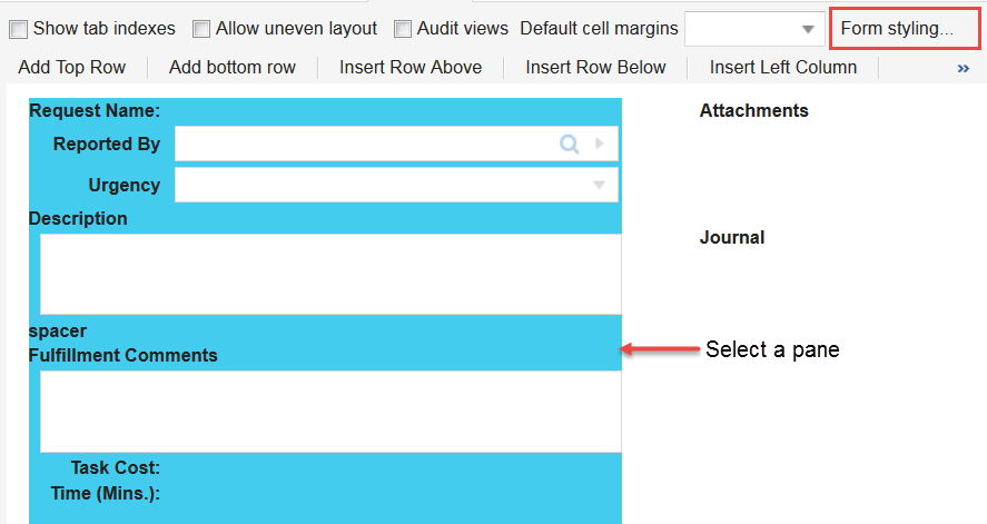
6.Click Form styling... on the toolbar to open the Form properties dialog box.
Form Properties Dialog Box
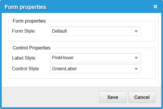
7.Change the control properties below by selecting choices available from the drop-down list.
| Item | Change to | Comment |
|---|---|---|
| Label Style | PinkHover | The style that you created above. |
| Control Style | GreenLabel | Select the style shown or any other style to apply. |
The changes that you make apply to the entire form. For information on how to edit a single control, see Applying the Style Format to a Single Control.
8.Click Save, then click Save on the toolbar to save the changes to the business object form.
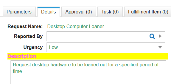
9.Return to the Service Desk Console.
10.Open a service request to verify that the changes that you made were applied. You may need to refresh the page.
11.From an existing service request, click the Details tab.
Note that the text on the form is green. Hover over a label and note that the label changes to pink text on a yellow background.
Verifying Changes
Applying the Style Format to a Single Control
1.From the Configuration Console, click Build > Business Objects to open the Business Objects workspace.
2.Open the Service Request business object.
3.Click Forms in the toolbar. The application displays a list of forms for that business object.
4.Select ServiceReq.DefaultForm (ServiceReq.DefaultForm) to open it.
5.Locate a control on the form such as fulfillment target.
6.From the Control Properties tab on the left pane, locate the label style rule and change the expression to $("PinkHover").
7.Save the form.
8.Verify your changes to the form by hovering over the control that you applied the format to. In this case, hover over Fulfillment Comments and note that the format changes. You can also check from the application by following the steps in Applying the Style Format to a Form.